EARNESTPersonal Loans Email System
Creating a distinct, scalable email identity for Earnest Personal Loans
Giving personal loans an identity of their own
Our new Personal Loan product had a recognition problem. For existing Earnest customers, cross-sell emails often looked nearly identical to Student Loan Refinancing — making a different offer feel like more of the same. I led the visual strategy and design for a more distinct Personal Loans identity: one that stayed unmistakably Earnest while making the product, value and next step easier to recognize at a glance.
Product identity + systemMY ROLELed art direction and hands-on design of the new Personal Loans email system, from visual exploration and modular template design through testing. I also explored how the system could scale across additional lifecycle stages and borrowing intents.
A different product was showing up like the same one.
The challenge was clearest in cross-sell: someone who already knew Earnest through refinancing could receive a Personal Loans offer that looked almost indistinguishable from the emails they were used to seeing. The layouts were consistent, but the product signal was weak — so customers had to read before they could understand that the offer itself had changed.
problemSTUDENT LOAN REFINANCING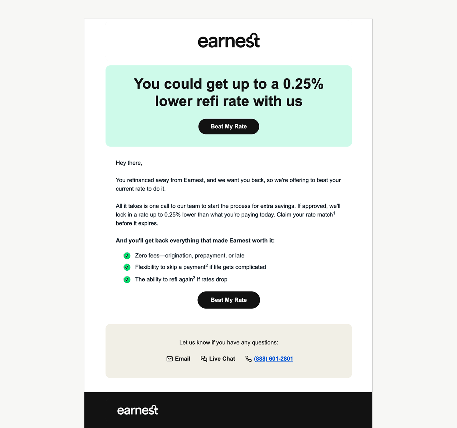
Existing system
Personal Loans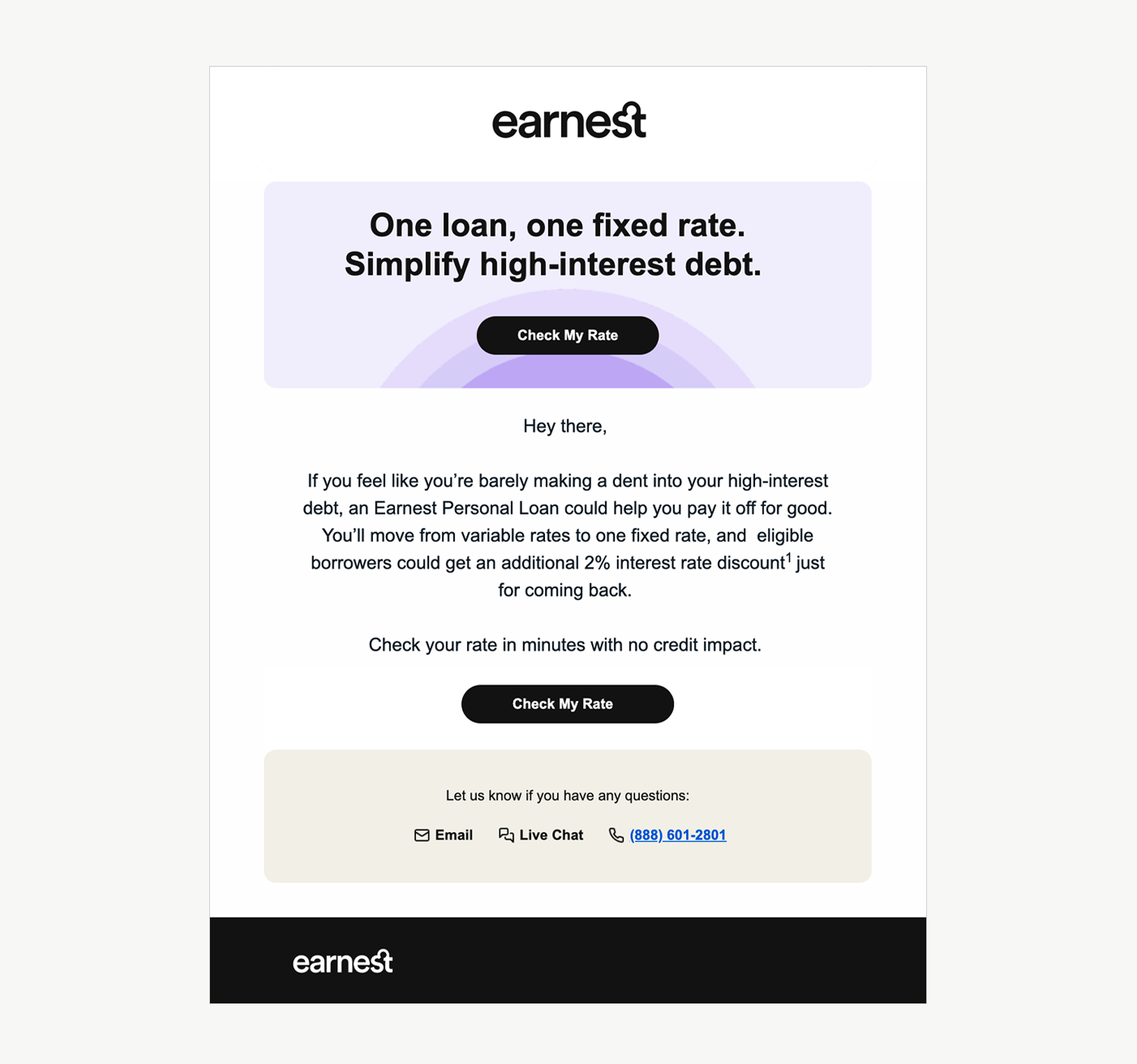
Existing system
Product cue came too late
The hierarchy prioritized Earnest first and relied on copy to explain which product was being offered.
The hero language was interchangeable
Pastel blocks, oversized headlines and black pill CTAs created the same first impression across products.
The journey felt templated
The same rhythm repeated from offer to body copy to CTA, regardless of product or customer mindset.
Recognition required effort
Customers had to stop and read before understanding that this was a different financial product.
Personal Loans needed stronger visual cues of its own, while still feeling unmistakably Earnest. The goal was to make the product difference clear at a glance, before customers had to read the details.
The sameness compounded across the journey.
The issue extended beyond a single cross-sell message. From abandoned rate checks through onboarding, Personal Loans reused the same basic visual language. That consistency made production easier, but it did little to help the product build recognition or adapt to what a customer needed at each stage.
Across lifecycle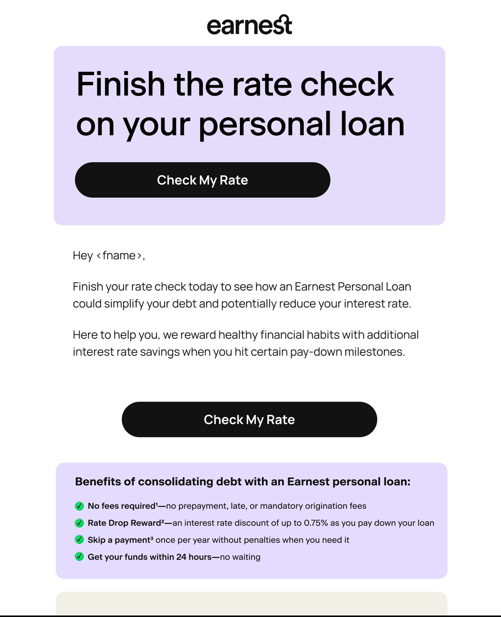
Rate Check
Abandoner
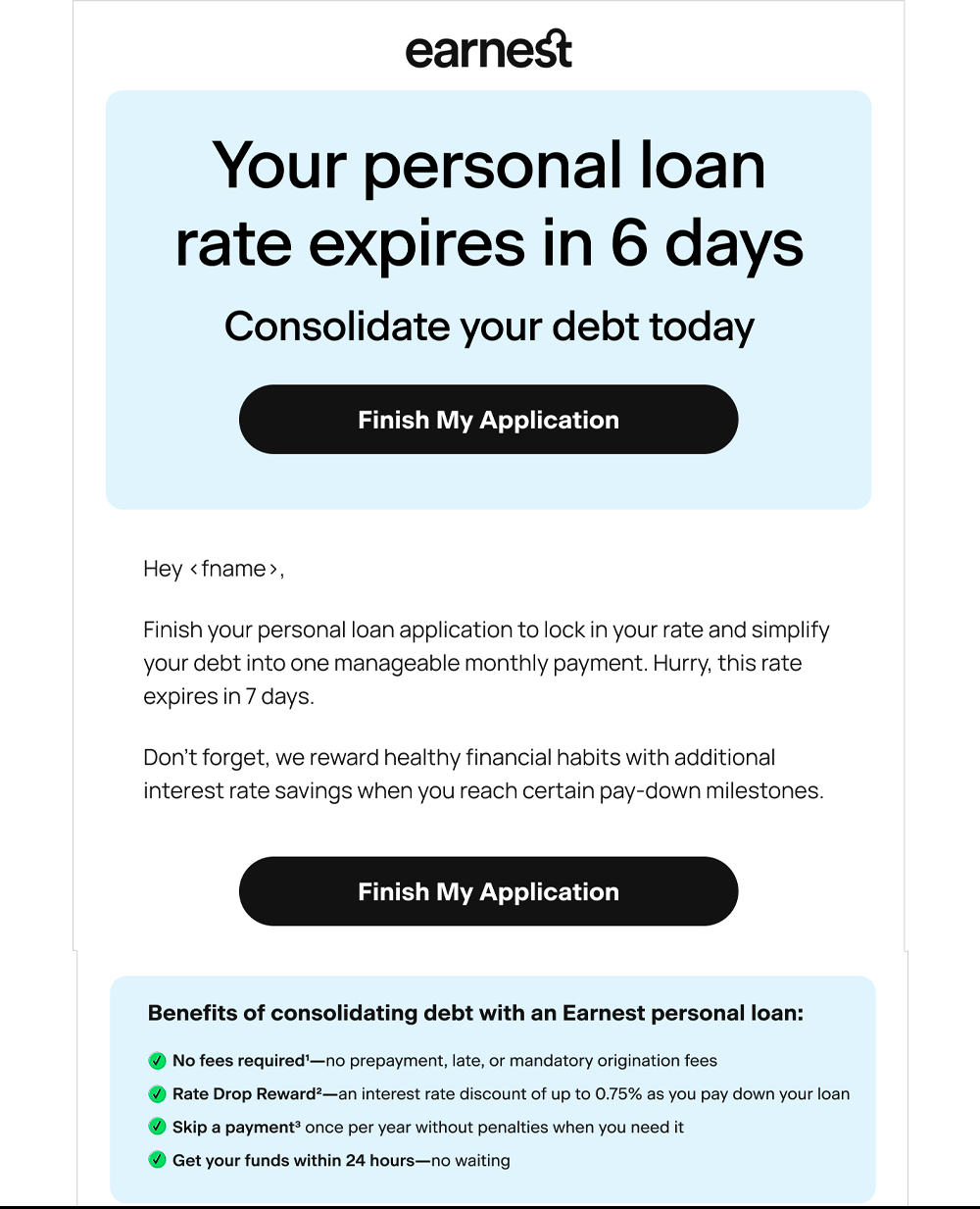
Application
Abandoner
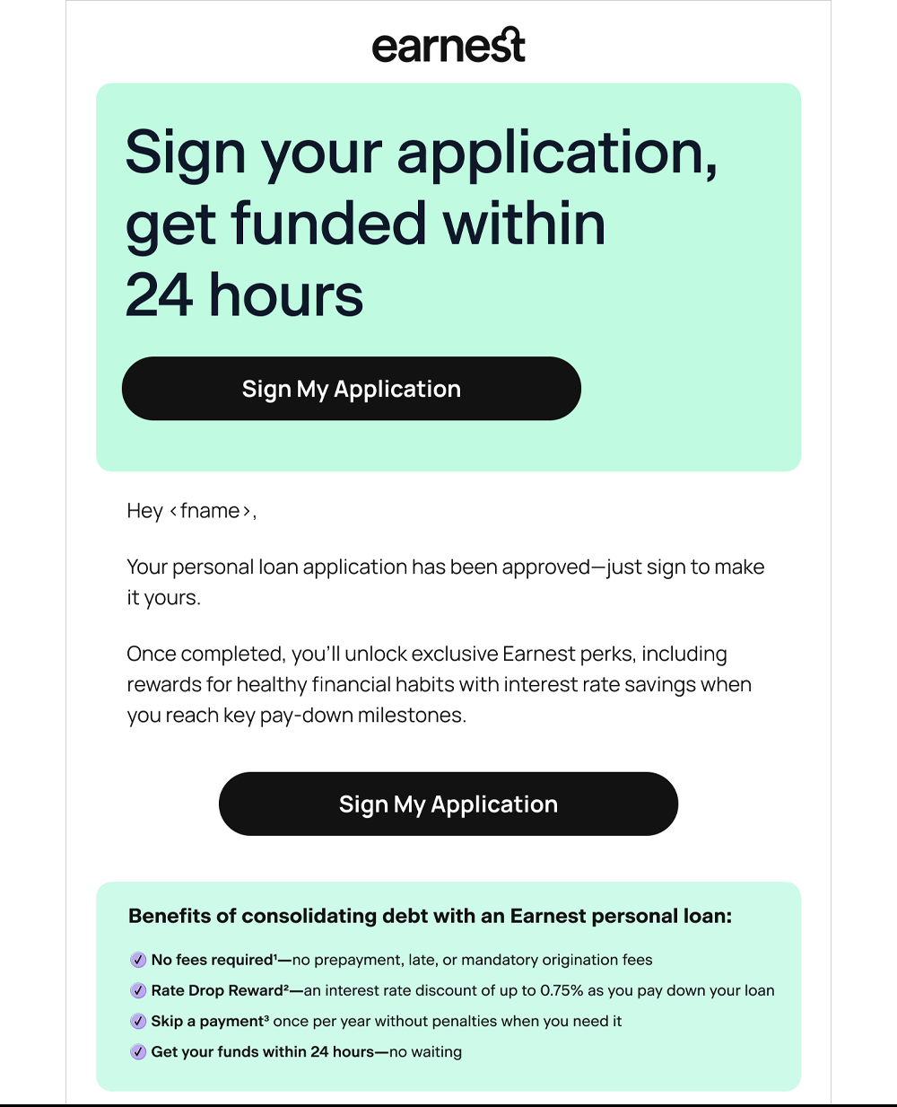
Approved
Not signed
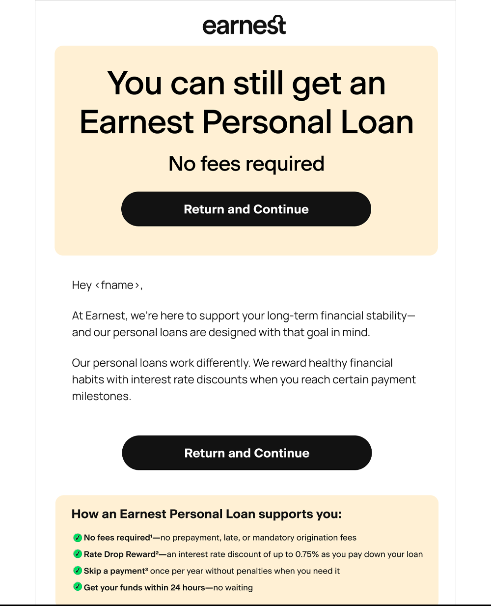
Winback
Re-engagement
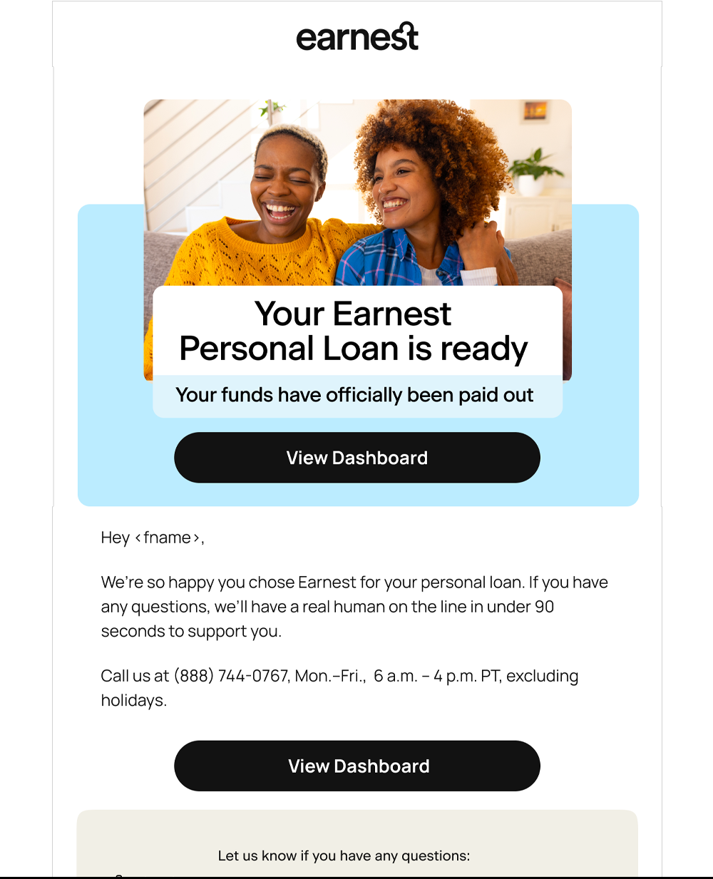
Onboarding
Funded
Giving Personal Loans a clearer visual identity in email
The new system gave Personal Loans a stronger set of recognizable cues within the Earnest brand: warmer, more human imagery; bolder product framing; more tangible benefit storytelling; and modular content that could flex by audience and message without starting from scratch each time.
Shipped + tested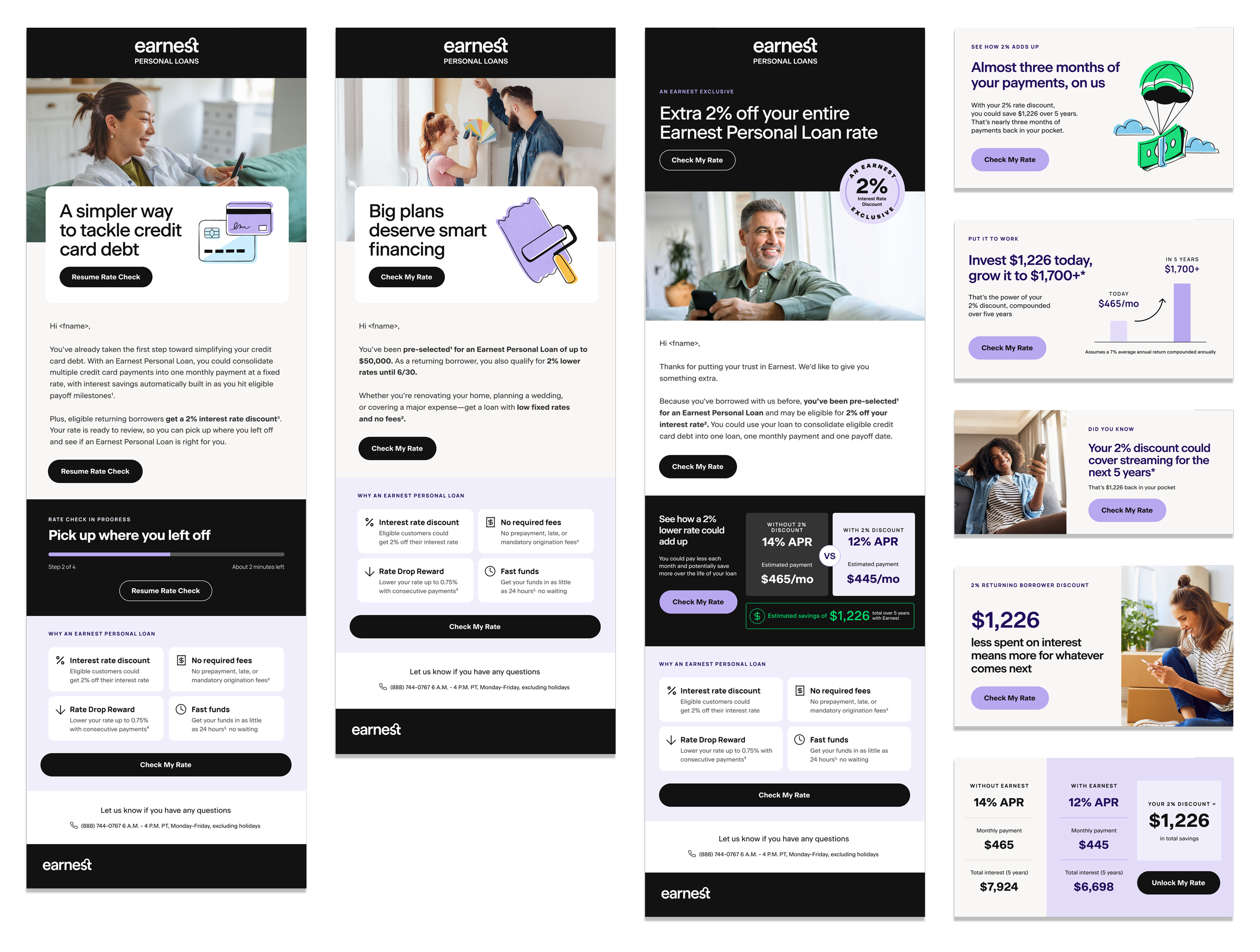
Signal the product sooner
Personal Loans needed to read as a distinct offer before a customer reached the body copy.
Make the value tangible
Move beyond abstract rate language into savings, debt simplification and real-life reasons to borrow.
Design for customer state
The hierarchy and tone should change depending on whether someone is exploring, hesitating, returning or already funded.
Build modules, not one-offs
Reusable components let the system scale while keeping enough flexibility for different messages and moments.
SYSTEM EXTENSIONFrom a stronger template to a scalable product system.
The shipped work established the new visual language. From there, I explored how it could scale across the full borrower lifecycle, adapting the hierarchy, tone and content to what customers needed at each stage while keeping the Personal Loans experience recognizable.
01Rate Check Abandoner
Reduce the effort of returning. Lead with continuity, not urgency.
02Application Abandoner
Use progress and time sensitivity to make the next step feel achievable.
03Approved Not Signed
Shift from persuasion to completion: fewer distractions, stronger confirmation.
04Universal Winback
Give a lapsed customer a new reason to reconsider, not just another reminder.
05Onboarding
Replace conversion pressure with reassurance, orientation and confidence.
The system could flex by customer, not just stage.
Beyond lifecycle, I also explored how the system could become more relevant through personalization. For customers borrowing toward a specific goal, like home improvement, the creative could shift from broad Personal Loans messaging to a more tailored story around what they were actually trying to accomplish — while still feeling like part of the same PL system.
Personalized messagingIMPACT+17%
The new direction also performed better.
click-through in the largest segment, statistically significant
+3% to +32%
higher click-through across all four segments tested
WHAT WE LEARNEDThe redesign made the next action clearer and improved engagement across every segment tested. But stronger click-through didn’t automatically translate to conversion, reinforcing that creative can improve attention and intent without solving every point of friction further down the funnel.
The new Personal Loans visual language also carried into lifecycle, creating a more consistent and recognizable product experience across touchpoints.